

Introducing WHAM - The Weekly Housing Affordability Metric
Want to know when the housing crisis started in a particular city? WHAM has the answer.

Welcome to the third installment of the Canadian Housing Microresearch Project (CHMP). Today, we look at housing affordability in three Canadian cities over time, using a new housing affordability metric, WHAM, which takes into account home prices, wage growth, and changing interest rates.
One common metric for measuring ownership housing affordability is comparing home prices to gross household income. This was the basis of the sadly dated “you can’t afford a home that is more than three times your gross family income” rule of personal finance. The idea is that if your gross household annual income is $100,000, you should look for a home priced at $300,000 or less.
Needless to say, there are very few places left in Canada where a family could realistically follow this rule. Hanif Bayat, who creates and posts all kinds of great charts on Twitter and LinkedIn, had a chart go viral showing ratios of 12.7 and 10.7 in Vancouver and Toronto, respectively, compared to 4.1 in Dallas and 3.8 in Minneapolis. A follow-up chart examining only Canadian metros shows a ratio of 7.3 in London, ON, compared to 4.2 in Winnipeg.
As a point-in-time measure, the price-to-income is incredibly useful. But looking at affordability over time, it is not quite as effective because it does not take into account interest rates. A 5-to-1 home price-to-income ratio is a lot easier for a new homebuyer to manage in a 3% mortgage rate environment (where financing costs are low) than it is in a 23% one. But this nuance is excluded from the price-to-income calculation, which excludes carrying costs.
Other affordability metrics adjust for interest rate changes by examining monthly mortgage payments as a percentage of income. The National Bank of Canada’s Housing Affordability Monitor charts this for several Canadian cities going back to 1980. The charts show the interest rate spike of the early 1980s, the house price bubble of the late 1980s, Toronto’s post-Financial Crisis home price boom, and the COVID-era unaffordability spike.

Source: National Bank of Canada.
The metric, however, assumes that the family can afford the downpayment on a home. Consider the following scenarios. In each, gross family incomes are the same, and each mortgage is amortized over 25 years:
Scenario 1: $516,000 mortgage at a 5% interest rate
Scenario 2: $336,000 mortgage at a 10% interest rate
Under both scenarios, the monthly payment is $3,000 a month. However, a 20% downpayment is much easier to save up for under the second scenario since the home price is 35% cheaper.1
It is possible to adjust for this phenomenon by creating a metric that simultaneously takes into account both downpayments and monthly mortgage payments.
Weekly Housing Affordability Metric (WHAM)
We have designed a new housing affordability metric, the Weekly Housing Affordability Metric, which is abbreviated to WHAM.2 WHAM is based on the following two questions:
How many weeks of pre-tax earnings would a full-time worker need in order to save for a 20% down payment on a home?
Over the first five years of the mortgage, how many weeks of a full-time worker’s pre-tax earnings would go towards just paying the mortgage?
In order to calculate WHAM, it is necessary to have three key data points:
Earnings: For this, we use the median weekly wage rate for full-time employees, found in the Statcan Table 14-10-0063-01. The table has wages by province, so if we’re looking at affordability in Halifax, we’ll use wage data for Nova Scotia. This data series covers the period from January 1997 to the present. If more historical data is needed, you could instead use average weekly earnings from the Survey of Employment, Payrolls and Hours (SEPH). The current Statistics Canada Table 14-10-0203-01 only covers from January 2001 to the present. However, Stephen Gordon’s Project Link contains SEPH data stretching back to January 1946.
Mortgage Rates: Statistics Canada’s Table 34-10-0145-01 contains 5-year fixed mortgage rates from January 1951 to the present, so it is an obvious choice here.
Home Prices: The Canadian Real Estate Association has a data portal that contains home prices by metro area and housing type from January 2005 to the present. For this article, we will examine single-family benchmark home prices, but the portal also contains data for single-family homes, townhouses, and condo apartments.
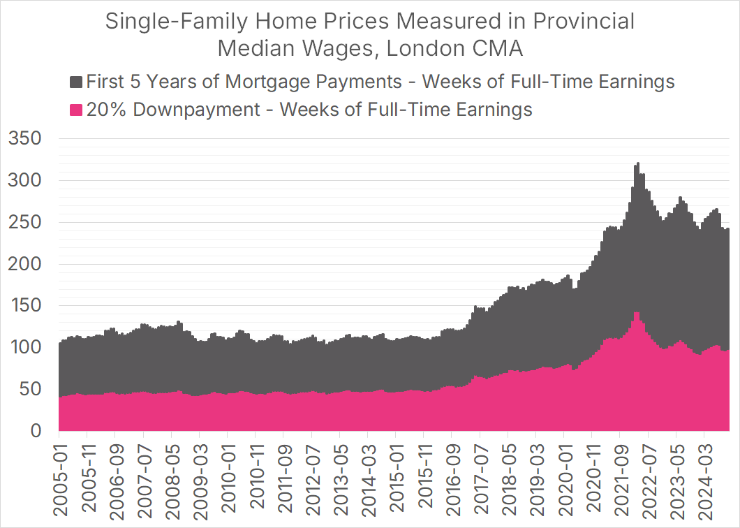
To see how this works, let’s take Mike Moffatt’s hometown of London, Ontario. For January 1, 2005, our data looks as follows:
Earnings: Median full-time weekly wages in Ontario were $773.20.
Mortgage Rates: Rates were 5.6%.
Home Prices: The benchmark single-family home price for the London-St. Thomas Area was $163,200. (sigh)
We can then calculate the weeks of pre-tax earnings needed to pay the downpayment and the weeks of earnings needed to pay for the first five years of the mortgage. To keep things simple, we’re excluding all kinds of costs, from land transfer taxes to closing costs. These could be incorporated into future versions.
Downpayment: A 20% downpayment on a $163,000 home is $32,640. $32,640 divided by the weekly wage of $773.20 is 42 weeks.
Five Years of Mortgage Payment: The mortgage amount is $130,560 (80% of $163,000). Using a mortgage calculator, we find that $130,560 amortized over 25 years at 5.6% gives a monthly payment of $809.57. Over 60 months, that is $48,574.10. Divided by the weekly wage of $733.20, we have payments equal to 63 weeks of pre-tax wages.
Added together, our WHAM score for single-family homes in London, ON, in January 2005 was 105; 42 weeks for the downpayment and 63 weeks for the first 5 years of mortgage payments.
If we map the individual components of the WHAM score over time, some affordability inflection points become apparent.

Key points on the timeline:
September 2008: Great Financial Crisis. Global interest rates crashed, causing a substantial decline in the First 5 Years component, which peaked at 81 in July 2008 and fell to 62 by April 2009. Home prices experienced a modest decline, so the Down Payment metric dropped from 50 to 46 over the same period, for a total WHAM score of 108.
February 2017: London, ON, home prices begin their pre-pandemic rise. Starting at a combined WHAM score of 127 (57 for downpayment, 70 for 5-year), the city consistently becomes less affordable over three years, reaching a WHAM score of 187 by February 2020 (82 downpayment, 105 for 5-year)
February 2022: Home prices explode during the pandemic, shooting the WHAM score up to a combined 318 weeks (144 downpayment, 174 for 5-year) by February 2022. In terms of weekly income, homes in London cost three times as much as in April 2009, even after factoring in wage growth and lower interest rates.
March 2022: Global interest rates begin to rise, and London’s home price bubble bursts. Lower home prices cause the downpayment component of the WHAM score to fall 49 points to 93 by January 2024. The 5-year component falls as well, but by a more modest 26 points to 148, as higher interest rates offset lower home prices.+
Stacking the two components on the same graph clearly and alarmingly indicates how much affordability has deteriorated in the London area. I often get asked, “When did the housing crisis start?” In the case of London, Ontario, we have a clear answer: February 2017, when the city’s WHAM score began a steady upward rise.
This isn’t the case everywhere. We can calculate Winnipeg’s WHAM score (using Manitoba’s wages) and see that the city did not experience skyrocketing home prices in 2017 but has seen a modest but real deterioration in housing affordability since the start of the pandemic.

Since Alberta is calling, let’s include Edmonton in our analysis. It has a substantially different affordability trend over time, with a 2006-08 home price bubble during the oil price boom. Unlike in London, housing affordability in the city today is right around where it was a decade ago, despite changes to interest rates and wages.

Comparing the three cities on a single graph shows how markedly different housing affordability has evolved in the three cities.

We hope other analysts adopt this WHAM metric for housing affordability. We will use it frequently in future CHMP pieces.
The National Bank Report does consider this nuance, as it reports on the months of downpayment savings needed, though that figure is not directly incorporated into the chart.
We’d call it Wham! with an exclamation mark, but that name was taken.