

Southern Ontario’s Home Affordability Crisis Remains at Near-Record Levels
For families who can obtain homes, they are paying more but getting less

Highlights
Housing affordability remains at crisis levels. Across Ontario, home prices have doubled relative to median family incomes since 2005 (in nominal dollars, those incomes were $64,000 in January 2005 and are $115,000 today).
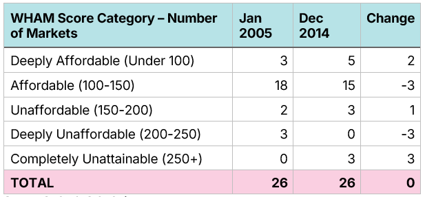
In 2005, 21 of 26 Southern Ontario single-family home markets were either affordable or deeply affordable for middle-class families, and none were unattainable. Today, there are no affordable or deeply affordable markets in Southern Ontario, and 11 of 26 are completely unattainable for middle-class families.
· In 2005, there were only 3 of 26 markets in Southern Ontario where a middle-class homebuyer of a single-family home would have to pay 25% or more of their pre-tax income on mortgage payments. Today, this is the case in all 26 markets.
Adjusted for inflation, home prices have doubled, and in some cases more than doubled, across Ontario over the past two decades, while real wages have only increased by 16%.
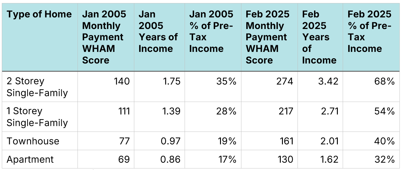
Using our WHAM Score metric, which considers home prices, incomes, and mortgage rates, we find that, relative to prices and incomes, a 2-storey family home in the GTA was as affordable in 2005 as an apartment is today.
A middle-class two-earner family who wanted to purchase a 2-storey family home in the GTA today would have to pay 68% of their pre-tax income in mortgage payments, a clear impossibility.
Going back to 1967, we find that GTA home prices are currently far more unaffordable than they were during the mortgage rate spikes of the mid-1970s and early-1980s and more unaffordable than they were during the late 1980s housing bubble.
Two elections and geopolitical events have caused the media and the public’s attention to turn away from the housing crisis. However, unaffordability is still at near-record levels across Southern Ontario. Middle-class families have been priced out of single-detached and semi-detached homes in much of Southern Ontario, as well as townhomes in large portions of the GTA.
This report analyzes trends in Southern Ontario home ownership affordability over the past two decades, using a methodology that incorporates both the size of downpayments and the size of mortgage payments. At the Missing Middle Initiative, we have created a metric of affordability known as the Weekly Housing Affordability Metric or Total WHAM Score. Unlike traditional affordability metrics, Total WHAM Scores incorporate changes in wages, prices, and mortgage rates to estimate the challenges in saving for a downpayment, along with the challenges in making monthly payments. It is calculated by answering two questions:
How many weeks of pre-tax earnings would a full-time worker need to save for a 20% down payment on a home?
Over the first five years of the mortgage, how many weeks of a full-time worker’s pre-tax earnings would be allocated solely to paying the mortgage, assuming that the buyer paid 20% down, obtained a 25-year amortization, and financed using a five-year fixed-rate mortgage?
Calculating the Total WHAM Scores metric requires data on wages, prices, and mortgage rates, with home prices typically being the most difficult to obtain. The best publicly available database on home prices is the Canadian Real Estate Association’s (CREA) data portal, which contains pricing data back to January 2005. This data enables us to track changes in housing affordability over the past two decades.
This report contains four sections:
First, we examine home price trends in the GTA over the past two decades. The GTA has the highest levels of unaffordability in the province. Home prices started rising first in the GTA, with unaffordability spreading to the rest of Southern Ontario after 2015.
Next, using municipal-level data for the GTA stretching back to 2012, we show that the rise in unaffordability in the GTA is not isolated to the City of Toronto and a handful of other cities. The middle class (which we define as families with a pre-tax income of $115,000) has been priced out of single-detached and semi-detached homes across the region, as well as townhomes in many markets. Apartments across the region are unaffordable, though attainable.
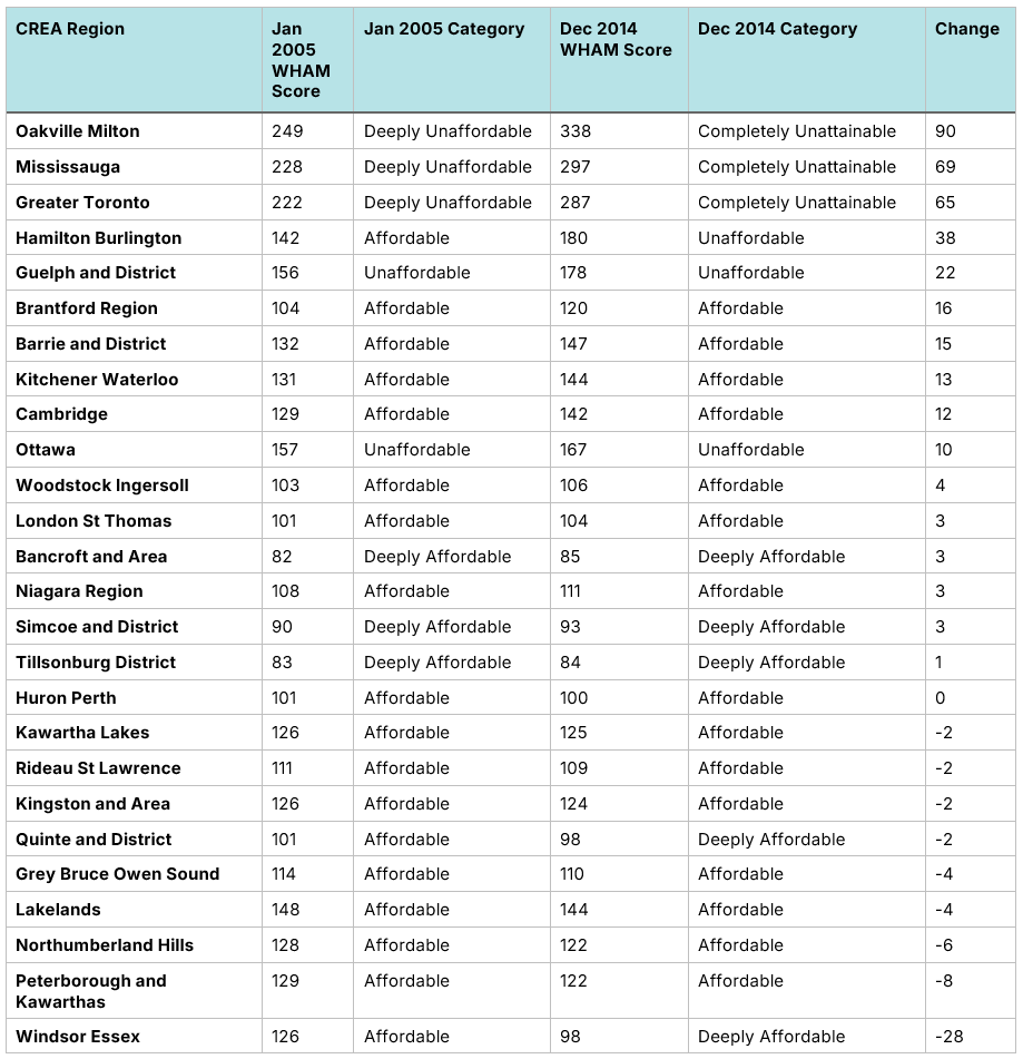
We then expand our analysis to the single-family home market in 26 different markets in Southern Ontario, paying particular attention to Hamilton-Burlington, Kitchener-Waterloo, London-St. Thomas and Ottawa. In January 2005, only five of 26 markets had single-family housing that was either Unaffordable or Deeply Unaffordable and none that was unattainable. Today, all but three markets are either Deeply Unaffordable or Completely Unattainable. This section shows how the GTAs' growing unaffordability continues to spread across all of Southern Ontario.
Finally, to give a longer-term perspective, we examine home price data for the GTA stretching back to 1967. Housing in the post-pandemic era is less affordable than at any time since 1967, including during the mortgage-rate spikes of the mid-1970s and early-1980s, and the late 1980s housing bubble.
GTA price-to-income ratios have doubled over the past 20 years
The Total WHAM Score affordability metric relies on three pieces of data: five-year fixed mortgage rates, wages, and home prices.
Mortgage rates directly impact affordability as they affect the size of monthly payments. Rates have fluctuated substantially over the past two decades but have returned to levels of 20 years ago, with rates at 5.6% in January 2005 compared to 5.39% in February 2025.
Figure 1: Canada - 5-year fixed mortgage rates
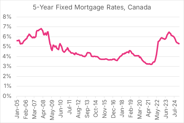
Source: Statistics Canada’s Table 34-10-0145-01
Over the same period, the weekly median pre-tax wage for full-time workers in Ontario between the ages of 25 and 54 has risen by 78%, not accounting for inflation. Weekly median wages, adjusted for consumer price inflation, have increased by 16% in real terms over the past twenty years.
Figure 2: Ontario - Median weekly earnings, full-time workers, 25-54 year olds
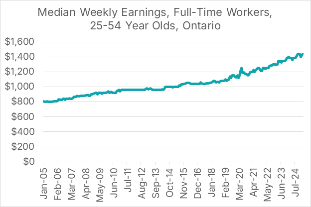
Source: Statistics Canada’s Table 14-10-0063-01.
We use weekly wage data in our model rather than annual income data, as annual income data is usually only available with a three-year lag (e.g. in 2025, our annual income data ends in 2022). However, we also recognize that people typically think of affordability in terms of annual family income, not the weekly wage of an individual earner. Fortunately, it is possible to derive an estimate of family income from the median weekly earnings data.
To calibrate median weekly earnings data with annual family-level income data for Ontario, we assume that a dual-earner couple earns 80 weeks of income during a year. Using this method, we define a middle-class or median-income family as one earning $115,000 as of February 2025.
Figure 3: Ontario - Median weekly earnings translated to annual family income
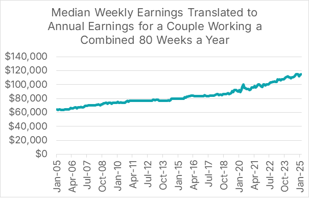
Sources: Statistics Canada’s Table 14-10-0063-01 and Table 98-10-0058-01, Author’s Calculation
Figure 4: Ontario - 80 hours of median weekly earnings vs. median total income
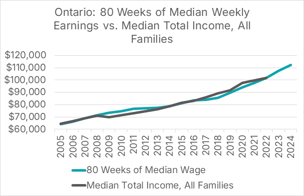
Sources: Statistics Canada’s Table 14-10-0063-01 and Table 98-10-0058-01, Author’s Calculation
GTA home prices have skyrocketed since 2005
The next data component we need is home prices. CREA’s data portal contains monthly home price data for the GTA for four types of homes:
1-storey single-family homes
2-storey single-family homes
Townhouse/row units
Apartment units
Definitions and calculation methodologies are published in their MLS Home Price Index Methodology guide.
Since 2005, home prices in the GTA have more than tripled, with townhouse units experiencing the highest growth, at 282%, and apartment units having the slowest growth, at 246%. Adjusted for inflation, these have risen by 148% and 124%, respectively, while real (inflation-adjusted) wages have increased by only 16%.
Figure 5: GTA - Home prices by unit type
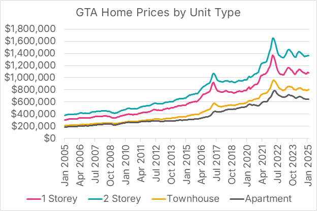
Source: Canadian Real Estate Association data portal
Using this wage and home price data, we can calculate price-to-annual pre-tax income ratios. As before, we assume that a middle-class Ontario family earns the equivalent of 80 weeks of median earnings each year. Price-to-income ratios have increased dramatically over the past twenty years, more than doubling for every type of housing, excluding apartments.
Figure 6: GTA - Price-to-income ratios by unit type
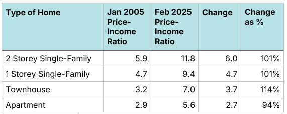
Source: Author’s Calculation
Figure 7: GTA - Price-to-income ratios by unit type since January 2005
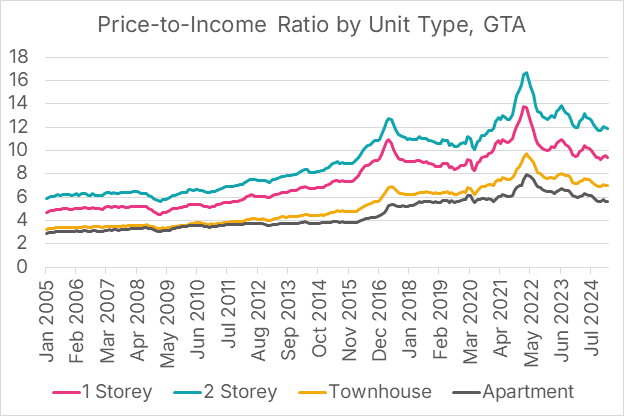
Source: Author’s Calculation
This stratospheric rise in home values has priced many families out of the market; for others, it means that they are getting less home for their wage-adjusted dollar than they would have gotten a decade or two ago.
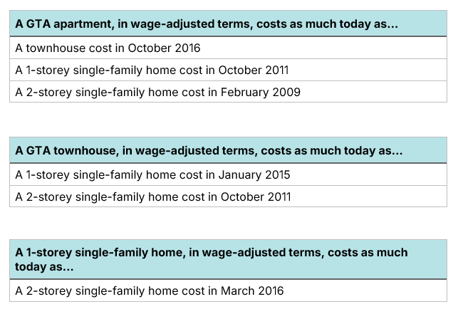
Over time, when it comes to GTA housing, families are spending more but getting less. Price-to-income ratios, however, do not account for changes in mortgage rates, which have a direct impact on affordability. We can control for changes in mortgage rates using the WHAM affordability metric.
The time needed to save for a down payment has doubled over two decades
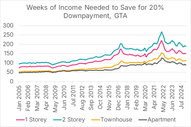
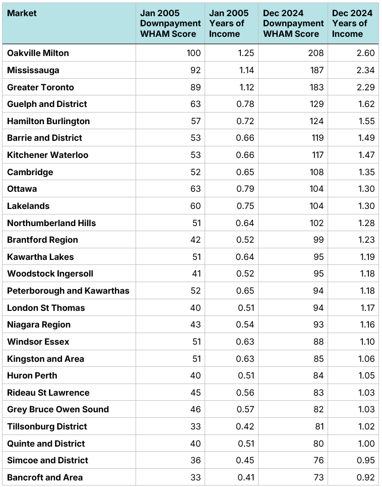
The first component of the WHAM housing affordability metric is the number of weeks of pre-tax income required to save for a 20% down payment, considering both changing home prices and changing wages. Downpayment WHAM scores have roughly doubled since 2005. In 2025, a 20% downpayment on a 2-storey home was equivalent to 2.37 years of pre-tax income for a median-income family. In 2005, it was a little over one year. It takes approximately as much money (in wage-adjusted terms) to save for an apartment today as it did for a 2-storey home in January 2005.
Figure 8: GTA - Downpayment WHAM scores by market for single-family homes. “Years of Income” represents a 20% downpayment measured in years of pre-tax family income.

Source: Author’s Calculation
Figure 9: GTA - Weeks of single-earner income needed to save for a 20% downpayment for a single-family home by market (Downpayment WHAM Score)
Source: Author’s Calculation
The 2022 spike in mortgage rates caused a jump in monthly payments
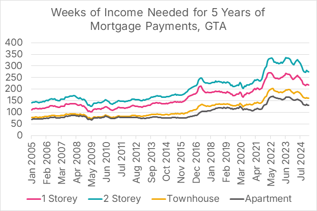
We can measure the wage-adjusted expense of monthly payments by the number of weeks of pre-tax income it takes to pay for the first five years of mortgage payments. The calculation assumes that the buyer took out a five-year fixed mortgage, made a 20% down payment, and uses prices, wages, and mortgage rates at the time of purchase in the calculation.
Wage-adjusted monthly payments were relatively stable from 2005 to 2014, as the increase in home prices was offset by a decrease in mortgage rates. During that period, although it took longer to save for a down payment, once you purchased the home, monthly payments, adjusted for wages, did not increase significantly.
This affordability trend shifted after 2015, as mortgage rates began to rise while home prices also continued to increase. The 2022 spike in mortgage rates led to a significant increase in monthly mortgage payments. Those payments have slowly started to fall as mortgage rates have declined and home prices have fallen from their 2022 peak. However, affordability remains a massive challenge. In 2005, a median-income family buying a 2-storey single-family home with a 20% downpayment with a 25-year amortization with a 5-year fixed mortgage would have to pay 35% of their monthly income in mortgage payments. Today, that family would have to pay 68%, showing that single-family homes in the GTA have become out of reach for most of the middle class.
Figure 10: GTA - Monthly Payment WHAM scores by market for single-family homes. % of Total Pre-Tax Income represents the % of a family’s pre-tax income that would be devoted to mortgage payments.
Source: Author’s Calculation
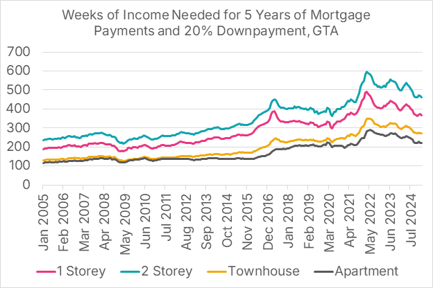
Figure 11: GTA - Weeks of single-earner income needed for 5 years of mortgage payments, GTA, assuming a 20% downpayment, 5-year fixed rate mortgage, and 25-year amortization (Monthly Payment WHAM Score)
Source: Author’s Calculation
The WHAM Total affordability metric shows GTA affordability at crisis levels
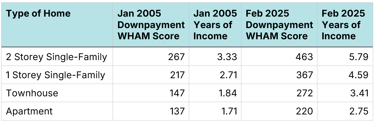
We can combine the 20% down payment metric and the 5-year mortgage payment metric into a single affordability metric known as a Total WHAM Score, where WHAM stands for the Weekly Housing Affordability Metric. The metric shows that it now takes twice as many weeks of income to pay for a 20% down payment and the first five years of mortgage payments as it did two decades ago.
Figure 12: GTA - Total WHAM Score. Years of Income represents a 20% downpayment and the first 5 years of mortgage payments, measured in years of pre-tax family income.
Source: Author’s Calculation
Figure 13: GTA - Total WHAM Score - Weeks of income for a single earner needed for 5 years of mortgage payments and a 20% downpayment with a 5-year fixed rate mortgage and a 25-year amortization
Source: Author’s Calculation
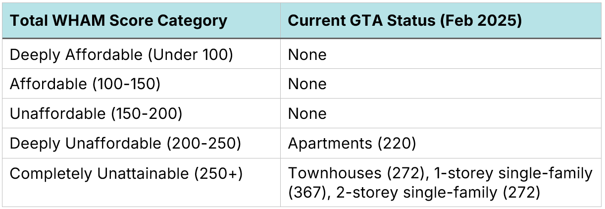
In normal times in Canada, the WHAM metric is under 150 weeks for single-family homes. Currently, in the GTA, it is at 220 weeks for apartments and 463 weeks for 2-storey single-family homes. A WHAM score above 250 is considered Completely Unattainable for a middle-class family unless they are gifted a large sum of money as a down payment.
Figure 14. Total WHAM Score categories
Source: Author’s Calculation
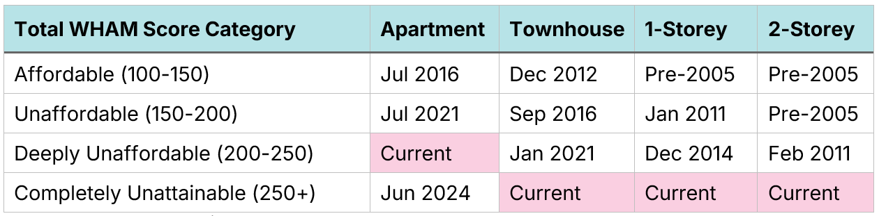
Currently, three of the four housing types are in the Completely Unattainable category. But that has not always been the case in the GTA. Over time, GTA homes have become less affordable. Prior to 2011, both apartments and townhouses were in the Affordable category, while 1-storey and 2-storey single-family homes were still attainable, although not always affordable.
Figure 15. GTA - The last month each home type was in each Total WHAM Score category
Source: Author’s Calculation
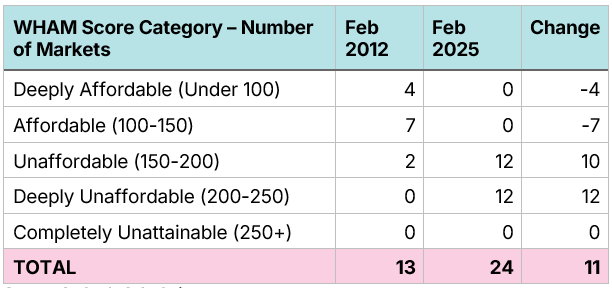
The Greater Toronto Area is a large place, incorporating over two dozen lower-tier and single-tier municipalities, which have highly related but not identical affordability challenges. While the CREA data portal does not break GTA-level data down by municipality, the Toronto Regional Real Estate Board (TRREB) has municipal-level price data stretching back 13 years to February 2012. We can use this data to examine community-level affordability trends over the past 13 years.
In most of the GTA, single-family homes are now out of the reach of middle-class families
The municipal-level data shows an across-the-board increase in unaffordability, with many places in the GTA becoming simply out of reach for median-income families. This unaffordability goes beyond the city of Toronto, with communities in Halton and York region, for example, becoming stratospherically expensive.
Our analysis is similar to before; however, the TRREB data uses slightly different categories, breaking housing types into four classifications:
Single-family detached homes
Single-family attached homes
Townhouse/row units
Apartment units
For each of the four types, homes have become substantially less affordable over the past 13 years.
Brock is the only community where detached homes are still theoretically attainable for the middle class
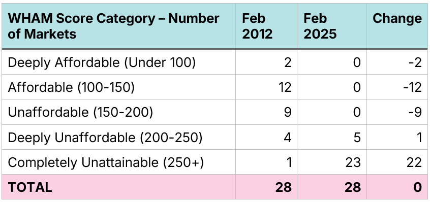
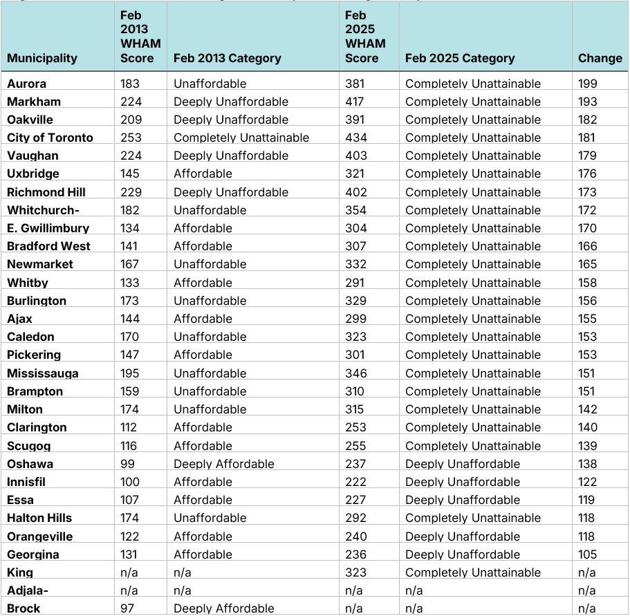
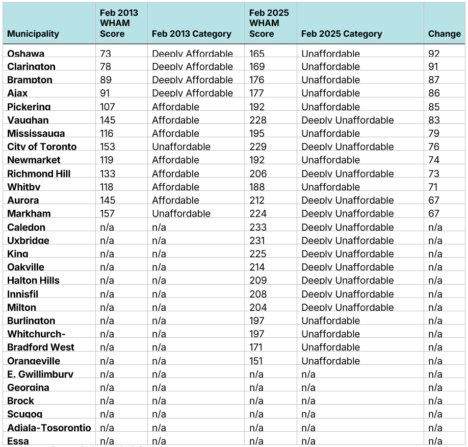
In February 2012, there were only nine of 30 communities in the GTA where a median-income family would be completely priced out of owning a detached single-family home without significant help with a downpayment; refer to Figure 17 for a complete list. There were all seven municipalities, Brock, Clarington, Essa, Georgina, Innisfil, Oshawa, and Scugog, that could be considered affordable. Today, there is only one community in the GTA, Brock, where a median-income family could even conceive of owning a detached single-family home.
Figure 16. GTA - Single-family detached affordability scores (Total WHAM Score)
Source: Author’s Calculation
Figure 17. GTA - Total WHAM housing affordability scores, single-family attached homes

Source: Author’s Calculation
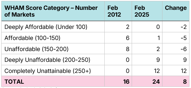
In 2012, single-attached homes were attainable in every GTA city except the City of Toronto. Today, they are unattainable in 23 different communities
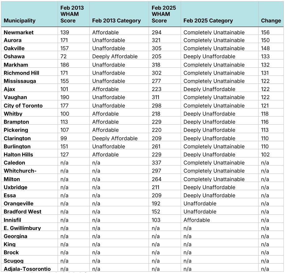
The picture does not appear much better for single-family attached homes, such as duplexes. In February 2012, there was only one municipality, the City of Toronto, where these were completely out of the reach of a median-income family, and in half of the communities (14 of 28), they were either Affordable or Deeply Affordable. Contrast this with today, where in 23 of 28 communities, they are completely out of reach for these families and five others (Essa, Georgina, Innisfil, Orangeville and Oshawa) are Deeply Unaffordable. The number of communities has been reduced from 30 to 28 due to the unavailability of these units in some markets.
Figure 18. GTA - Single-family attached affordability scores (Total WHAM Score)
Source: Author’s Calculation
Figure 19. GTA - Total WHAM housing affordability scores, single-family attached homes
Source: Author’s Calculation
Townhomes were once relatively attainable across the GTA. Today, they are out of reach in much of the region
In 2012, if a GTA community had townhomes, they were, at worst, somewhat unaffordable to median-income families, and in half of the communities where they were available, they were either Affordable or Deeply Affordable. Thirteen years later, townhomes are readily available in more communities, but they certainly are not more affordable. In 12 of 24 communities, they have become completely out of reach for middle-income families, which includes some of the biggest cities in the region: Aurora, Burlington, Caledon, Markham, Milton, Mississauga, Newmarket, Oakville, Richmond Hill, Toronto, Vaughan and Whitchurch-Stouffville.
Figure 20. GTA - Townhome affordability scores (Total WHAM Score)
Source: Author’s Calculation
Figure 21. GTA - Total WHAM housing affordability scores, townhomes
Source: Author’s Calculation
Middle-income families can still attain apartments in every community, though, in half of municipalities, they are deeply unaffordable
It was not that long ago that a median-income family could attain a condo apartment to live in. Back in 2012, apartments were either Affordable or Deeply Affordable to these families, with only Markham and the City of Toronto falling into the Unaffordable category. Today, not a single community has affordable apartments for middle-income families, with half of the communities falling under Unaffordable and the other half falling under Deeply Unaffordable. Like with townhomes, apartments are, at least theoretically, available in far more communities in 2025 than they were in 2012.
Figure 22. Apartment affordability scores (Total WHAM Score)
Source: Author’s Calculation
Figure 23. WHAM housing affordability scores, apartments in the GTA
Source: Author’s Calculation
Middle-class families are spending more but getting less
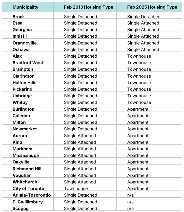
Another way to examine the data is to identify the largest housing type (in terms of floorspace) in each community with a WHAM score under 250, our cut-off point for what is theoretically attainable. In 2012, a median-income family could attain either a single-attached or single-detached family home in every community except Toronto. Today, these are only attainable in six communities, with townhouses and apartments being the largest attainable type in most communities. Today, families are spending more but getting less.
Figure 24. Largest home type with a Total WHAM affordability score under 250
Source: Author’s Calculation
Housing unaffordability has spread across Southern Ontario over the last decade
In an earlier research report, we showed the growing rise in unaffordability by examining the WHAM Scores for single-family homes in Southern Ontario between January 2005 and December 2024. It showed that, like in the Greater Toronto Area, it showed that single-family homes have increased in price since 2005. We will reuse the data from that report to show the rise in unaffordability across Southern Ontario.
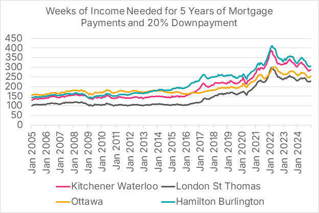
We examine four markets in detail: Kitchener-Waterloo, London-St. Thomas, Ottawa, and Hamilton-Burlington, though our data tables contain information on 26 different markets across Southern Ontario.
Figure 25: Single-family home prices by market
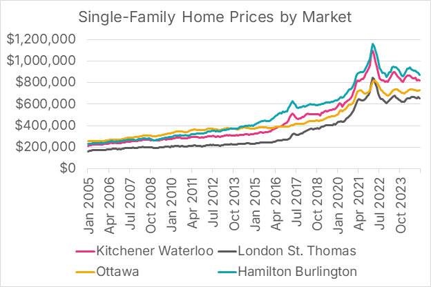
Source: Canadian Real Estate Association data portal
Price-to-income ratios have also skyrocketed over the last decade
Price-to-income ratios have also roughly doubled in most Southern Ontario markets over the past two decades. In 2005, benchmark single-family homes were under three times annual pre-tax income for many Ontario markets. By December 2024, no southern Ontario market had a price-income ratio under 4.6.
Figure 26: Price-to-income ratios for single-family homes by market
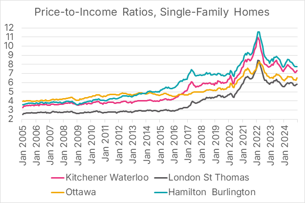
Source: Author’s Calculation
Prior to 2015, increases in price-to-income ratios were largely isolated to the Greater Toronto and Hamilton Area. In fact, the price-to-income ratio for single-family homes actually fell in the Windsor area between January 2005 and December 2014. Figure 27, which shows price-to-income increases from January 2005 to December 2024, shows widespread price increases across the board, whereas Figure 30, which shows price-to-income increases from the first 10 of those 20 years (January 2005 to December 2014), shows only modest price-to-income ratios in most of Southern Ontario.
Figure 27: Southern Ontario - Price-to-income ratios for single-family homes by market, January 2005 and December 2024 (Last 20 Years)
Source: Author’s Calculation
Figure 28: Southern Ontario - Price-to-income ratios for single-family homes by market, January 2005 and December 2014 (10-20 Years Ago)
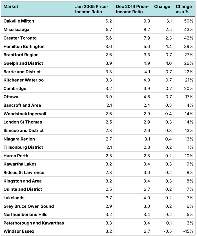
Source: Author’s Calculation
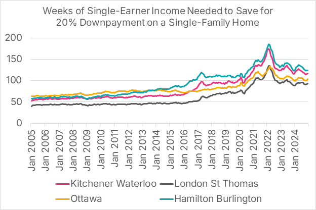
As with the GTA, the time needed to save for a down payment has doubled over two decades
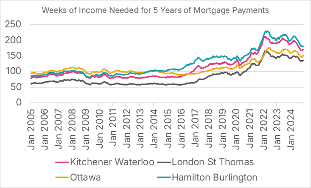
Skyrocketing price-to-income ratios are reflected in the amount of money, relative to wages, it takes to save for a home down payment. In the London-St. Thomas market, for example, in January 2005, it took 40 weeks of pre-tax single-earner income to save for a 20% downpayment of a home, equivalent to half of one year’s pre-tax income for a couple. By December 2024, it took 94 weeks of pre-tax income, equivalent to 1.17 years’ worth of a family’s pre-tax income.
Today to buy a home in Windsor, it takes 88 weeks of pre-tax income to pay for a down payment for a single-family home. This level of downpayment is the same amount of wage-adjusted income it took in January 2005 to pay for a home in the GTA. Over the last two decades, high housing costs have spread across Southern Ontario.
Figure 30: Weeks of single-earner income needed to save for a 20% downpayment for a single-family home by market (Downpayment WHAM Score)
Source: Author’s Calculation
Figure 31: Downpayment WHAM Scores by market for single-family homes. Years of Income represents a 20% downpayment measured in years of pre-tax family income.
Source: Author’s Calculation
Mortgage payments relative to income have also doubled over the past two decades
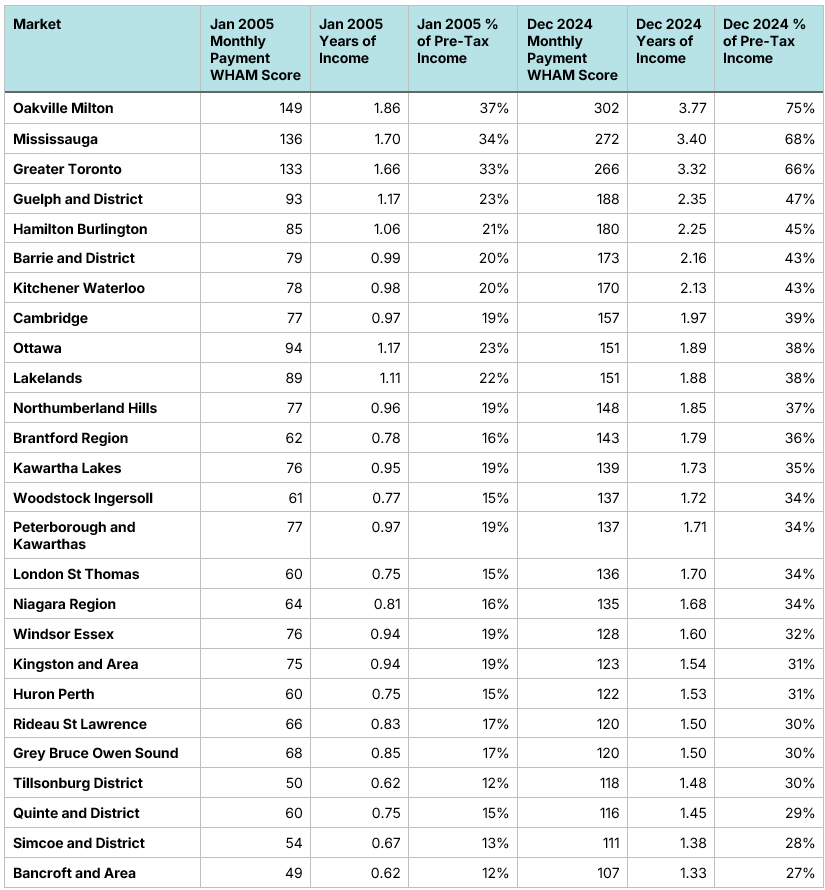
We have used the term “skyrocketing” several times in this report, as few other words can truly capture the enormous increase in home prices over the past two decades. Mortgage payments, relative to income, have also skyrocketed. In January 2005, in only 3 of 26 markets, an average middle-class family who wanted to buy a home would see more than 25% of their pre-tax income devoted to mortgage payments. Today, every single market crosses the 25% threshold. In 2005, only Oakville-Milton’s monthly mortgage payments relative to middle-class income exceeded 35%. Today, half of all Southern Ontario markets exceed 35%, with Oakville-Milton’s figure reaching an eye-watering 75%. In much of Ontario, middle-class families were priced out of middle-class homes.
Figure 32: Weeks of single-earner income needed for 5 years of mortgage payments for single-family homes, assuming a 20% downpayment, 5-year fixed rate mortgage, and 25-year amortization (Monthly Payment WHAM Score)
Source: Author’s Calculation
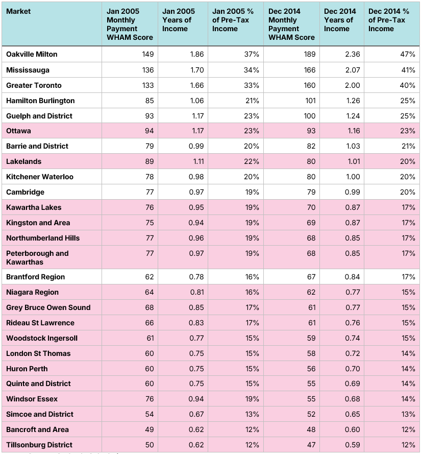
Figure 34 shows that in 17 of 26 markets, monthly mortgage payments for new middle-class home buyers fell from 2005 to 2014, thanks to lower mortgage rates, despite price-to-income ratios rising in every market except Windsor. There is a commonly held belief that lower mortgage rates necessarily lead to big decreases in affordability, as the lower rates substantially drive up the price of homes. While this is often true in supply-constrained markets, like the GTHA between 2005 and 2014, in markets where there is an adequate supply of homes, like much of Southern Ontario prior to 2015, the net impact of lower mortgage rates is lower mortgage payments, as the impact of lower rates on monthly payments more than offsets any rate-stimulated price rise.
Figure 33: Monthly Payment WHAM scores by market for single-family homes. % of Total Pre-Tax Income represents the % of a family’s pre-tax income that would be devoted to mortgage payments. Pink = Markets where mortgage payments relative to income decreased. (January 2005 to December 2024)
Source: Author’s Calculation
Figure 34: Monthly Payment WHAM scores by market for single-family homes. % of Total Pre-Tax Income represents the % of a family’s pre-tax income that would be devoted to mortgage payments. Pink = Markets where mortgage payments relative to income decreased. (January 2005 to December 2014)
Source: Author’s Calculation
The WHAM Total affordability metric shows that, like the GTA, the rest of Southern Ontario has an affordability crisis
The combined impact of sky-high housing prices relative to income and the post-pandemic increase in mortgage rates has caused a substantial deterioration in housing affordability. In January, Kitchener-Waterloo, London-St. Thomas and Hamilton-Burlington were all classified as Affordable by the Total WHAM Score metric, and Ottawa was just slightly in the Unaffordable category, with a Total WHAM Score of 157. Today, Ottawa, Kitchener-Waterloo, and Hamilton-Burlington are all classified as Completely Unattainable, while London-St. Thomas has been designated as Deeply Unaffordable by the Total WHAM Score metric.
Figure 35: Total WHAM Score - Weeks of income for a single-earner needed for 5 years of mortgage payments and a 20% downpayment with a 5-year fixed rate mortgage and 25-year amortization for a single-family home
Source: Author’s Calculation
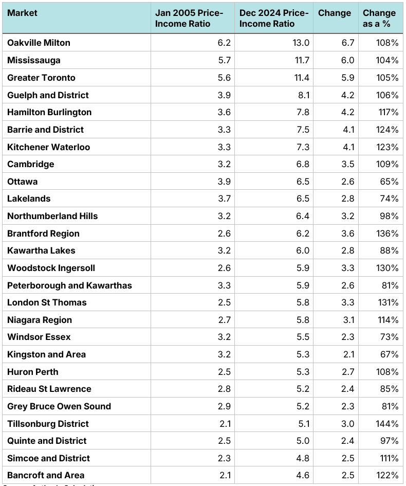
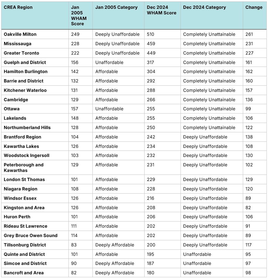
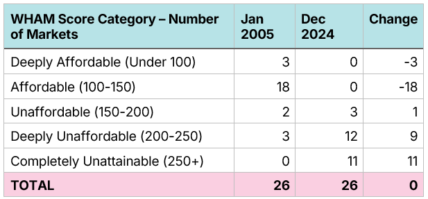
This deterioration of affordability has occurred across Southern Ontario. The Total WHAM Score method shows that in 2005, only 5 of 26 single-family home markets could be considered Unaffordable or Deeply Unaffordable. As of December 2024, every Southern Ontario single-family home market is considered either Unaffordable, Deeply Unaffordable, or Completely Unaffordable, with only three markets (Bancroft and Area, Quinte and District, and Simcoe and District) receiving only an Unaffordable score.
Figure 36. Ontario Single-Family Home Affordability Scores (January 2005 to December 2014)
Source: Author’s Calculation
Figure 37. WHAM housing affordability scores, single-family homes in Ontario (January 2005 to December 2024)
Source: Author’s Calculation
Outside of the GTHA, the deterioration in affordability is a post-2014 phenomenon
Examining Total WHAM Score data for February 2005 to December 2014 illustrates the recency of rises in unaffordability in Southern Ontario outside of the GTHA. During that decade, Oakville-Milton, Mississauga, and the Greater Toronto markets jumped from Deeply Unaffordable to Completely Unattainable, while Hamilton-Burlington moved from Affordable to Unaffordable. During that same period, however, nine markets saw an improvement in affordability, with two markets, Windsor-Essex and Quinte and District, moving from Affordable to Deeply Affordable. In the case of Windsor, this was not an unambiguously good news story, as much of the increase in affordability resulted from economic weakness in the region.
In short, most of the increase in unaffordability in Southern Ontario occurred in the last ten years, not the ten years before them.
Figure 38. Ontario Single-Family Home Affordability Scores (January 2005 to December 2024)
Source: Author’s Calculation
Figure 39. WHAM housing affordability scores, single-family homes in Ontario (January 2005 to December 2014)
Source: Author’s Calculation
Going back to 1967: A longer-term historical perspective
Comparing housing affordability to 2005 or 2012 clarifies recent history, but it cannot illustrate long-term changes. For example, one of the most common questions we receive is, “Are homes more affordable today than they were in the sky-high mortgage rate era of the late 1970s and early 1980s?”.
We can answer that question with the use of WHAM housing scores, along with TRREB annual home price data that stretches back to 1967 for the GTA. Unfortunately, the data is annual, not monthly, for a single “benchmark” home category, and we must use a different source for wage numbers due to data availability; see the appendix for methodological details. As such, these numbers should not be directly compared to those in the previous section; however, they can give us an idea of how GTA housing affordability has evolved since 1967.
As before, we break our analysis into a downpayment and a monthly payment metric and combine the two to obtain our Total WHAM affordability score.
Today’s high mortgage rates have nothing on the 1970s and 1980s
Although the post-pandemic spike in mortgage rates seems dramatic, it has nothing on the increases of the late 1970s and early 1980s. By the early 1980s, rates exceeded 20%, causing a substantial rise in monthly payments.
Figure 40: Canada - 5-year fixed mortgage rates
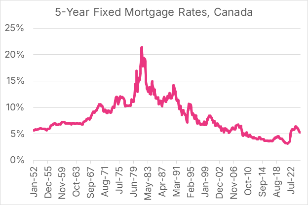
Source: Statistics Canada’s Table 34-10-0145-01
Nominal wages have increased by 1250% since 1967
Using average weekly earnings data for Canada from the Survey of Employment, Payrolls and Hours (SEPH), we see that nominal average earnings for an employee across Canada have risen by 1250% since 1967. As such, if home prices kept pace with wage increases, we would expect them to have also increased by 1250%. However, home prices rose substantially more than wages.
Figure 41: Canada - Average weekly earnings
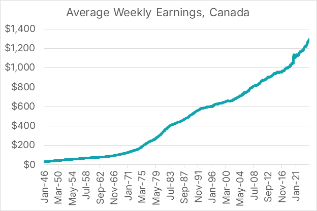
Sources: Statistics Canada Table 14-10-0203-01 and Stephen Gordon’s Project Link.
GTA home prices have increased by 4540% since 1967
Between 1967 and 2024, home prices rose much faster than wages in the GTA, causing the nominal price of homes to be 46 times higher than they were during Canada’s centennial. Home prices, relative to wages, are now 3.6 times higher today than they were in 1967. This rise in price has been offset slightly by the fact that dual-income couples are more common today than they were then.
Figure 42. GTA - Annual average home price by year
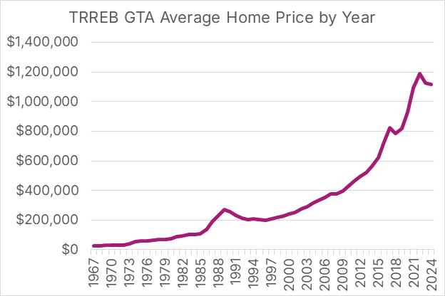
Source: TRREB historical archive.
It takes over three times longer to save for a down payment than it did from 1967 to 1985
From 1967 to 1985, the price of a home, measured in median wages, was remarkably consistent. On average, during this period, it took exactly one year’s worth of a worker’s pre-tax income to finance a 20% downpayment on a home. Wage-adjusted downpayments skyrocketed during the late 1980s housing bubble, peaking at 108 weeks in 1989. After falling to 65 weeks in 1996, this has been steadily increasing since then, reaching 204 weeks during the peak prices of 2022. The metric fell to 177 weeks in 2024, a substantial decline but still over three times higher than the levels between 1967 and 1985.
Figure 43. GTA - Weeks of income needed to save for a 20% down payment
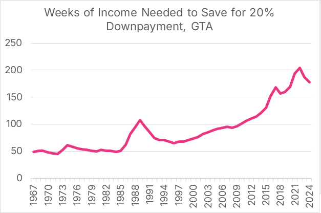
Source: Author’s Calculation
Monthly payments, relative to wages, are well above the high-mortgage rate periods of the 1970s and early 1980s
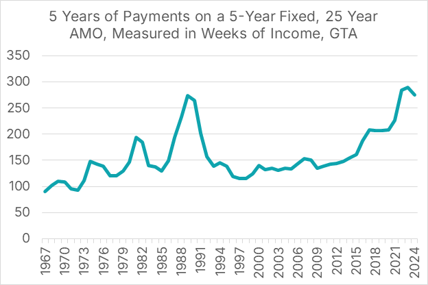
The monthly payment data highlights the impact of high and fluctuating mortgage rates. Monthly payments, measured in average weekly wages, did spike in the mid-1970s and early 1980s; however, because home prices were relatively low, monthly payments (denominated in wages) never reached the levels they did in the late 1980s or after the pandemic. Payments during both the late 1980s housing boom and the post-pandemic era were particularly crushing, as mortgage rates rose quickly and home prices were incredibly high relative to income. Monthly payments reached 274 weeks of average income by 1989, which priced the middle class out of housing. After the home price crash of 1990, monthly payments relative to wages would not return to that level for over thirty years, reaching 284 weeks in 2022. Payments relative to income would continue to climb, reaching 290 weeks in 2023 before falling to 275 weeks in 2024, nearly identical to the 1989 peak.
Figure 44. GTA - Weeks of single-earner income needed for 5 years of mortgage payments, GTA, assuming a 20% downpayment, 5-year fixed rate mortgage, and 25-year amortization (Monthly Payment WHAM Score)
Source: Author’s Calculation
Home prices have been at historical levels of unaffordability during the post-pandemic era
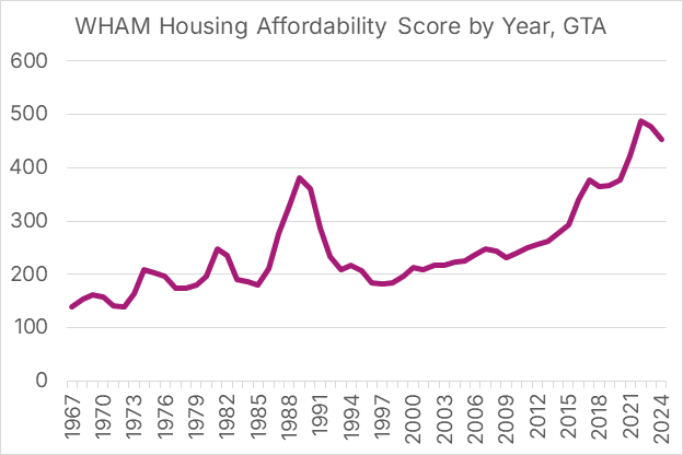
As before, we can combine the two measures to create a WHAM Total Affordability score for the GTA going back to 1967. Outside of the late 1980s bubble, the WHAM Total Affordability score for the GTA was never below 250 or above 150 between 1973 and 2011, with the caveat that this score is not directly comparable to the previous section since it uses a different data series for weekly earnings. During that bubble, the unaffordability metric spiked, reaching 371 weeks in 1989 before falling to 184 in 1996.
There was a steady deterioration of affordability between 1996 and 2014, which then skyrocketed in 2015 as both prices and mortgage rates rose, reaching a pre-pandemic peak in 2017 of 377 weeks of average income needed for a 20% downpayment and five years of mortgage payments, a level of unaffordability that exceeded the late 1980s housing bubble. The post-pandemic price spike caused the metric to reach an all-time high of 488 weeks in 2022. It has since fallen to 453 weeks, a level of unaffordability much higher than any year between 1967 and 2021.
Figure 45. GTA - WHAM Total housing affordability score for the GTA since 1967. Higher = Less Affordable
Source: Author’s Calculation
Final thoughts
Middle-class housing affordability remains a crisis across Southern Ontario. A young median-income family in the GTA has little hope of being able to afford a family-sized home unless they have received a large gift for a down payment. The situation is not much better in the rest of Southern Ontario. The price of homes and the size of the downpayment that goes along with it have been the largest source of unaffordability, as home prices, measured in median wages, have doubled across Southern Ontario since 2005. Policymakers from all orders of government need to recognize the crisis for what it is and take action to restore the dream of home ownership to young, middle-class families.
Methodology, data sources, and data appendix
Earnings: For analysis covering January 1997 to the present, we use the median weekly wage rate for full-time employees between the ages of 25 and 54, found in the Statcan Table 14-10-0063-01. The table displays wages by province, so when examining affordability in Toronto, we’ll use the wage data for Ontario. Because that series does not extend earlier than 1997, for pre-1997 analysis, we instead use average weekly earnings from the Survey of Employment, Payrolls and Hours (SEPH). The current Statistics Canada Table 14-10-0203-01 only covers the period from January 2001 to the present. However, Stephen Gordon’s Project Link contains SEPH data dating back to January 1946. Unfortunately, this data is only available at the national level. For SEPH earnings data, we “Average weekly earnings including overtime for all employees, industrial aggregate excluding unclassified businesses.”
Mortgage Rates: Statistics Canada’s Table 34-10-0145-01 contains 5-year fixed mortgage rates from January 1951 to the present.
Home Prices: The Canadian Real Estate Association has a data portal that contains home prices by metro area and housing type from January 2005 to the present. The Toronto Region Real Estate Board has data at a municipal level stretching back to February 2012, along with an annual historical archive.
Download a PDF version of this article below: